Designer
The designer is the main tool for modeling and customization of a REWOO Scope application. It is available for Admin and Power users only.
Access designer
To open it, click on the designer icon at the top of the menu.

The designer can also be called directly from a form. You will find several links in the footer of the datasheet. The type link opens the list of all datasheet fields, the layout link opens the layout designer.

Overview and features
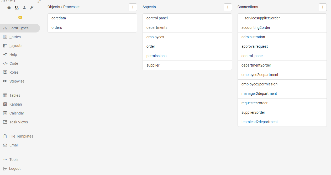
The following functional areas are available in the Designer view:
- Form Types
- Fields
- Layouts
- Help
- Code
- Roles
- Stepwise
- Table Views
- Kanban Boards
- Calendars
- Task Views
- File Templates
Form Types
In this area the different types (objects, processes, aspects and relations) can be created, edited or deleted. To edit or delete an existing type, select the desired type. The corresponding icons will then appear above the list.
For aspect types, there are additional settings for each level:
- the creating user can get a connection from his login node to the new element
- The name of the elements can be determined by a form field

Fields
A data sheet consists of a list of fields. Some are filled by users or data imports, while others contain formulas that calculate new content from existing values.
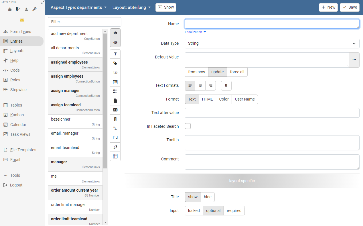
The name is used as the title of the field in the form view, but also serves as a reference to the value in the formula language. If the form is to be offered in different languages, a localization can also be specified.
Each field has a data type that cannot be changed after it has been created. (ActionButton, Boolean, Choice, Condition, ConnectionButton, CopyButton, Date, ElementLinks, Email, EmailFiles, ExternalLinks, FileLinks, FileReview, FileTree, Image, Label, Matrix, MultipleChoice, PrevLinks / NextLinks, Number, RichText, Signature, SpreadsheetFile, String, Table, TrafficLight, UserSelectedLinks, ViewButton).
If you want to store a default value, such as a formula, for a field, you must choose a strategy for existing forms before you save:
- from now - does not change any existing form
- update - adjusts all forms containing the old default value
- change all - saves the new default value for all forms with status template, in planning, active or inactive
Layouts
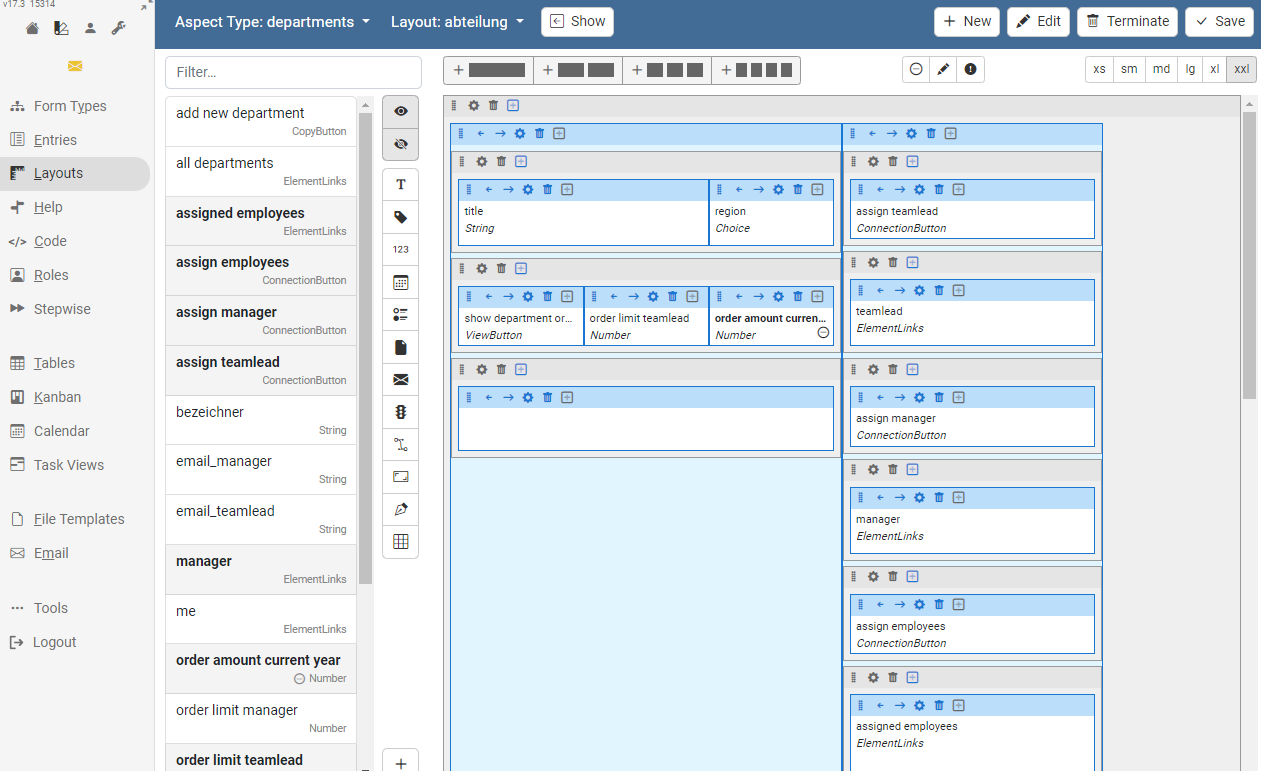
The forms can be designed in the layout view. The Bootstrap Framework is used to display forms in REWOO Scope. This means that the respective form must be arranged in a grid with 12 columns per row. A detailed overview of how Bootstrap works can be found here.
The created layouts are responsive. However, they can be optimized for individual screen sizes. For this purpose, the display can be switched to the usual size classes in Bootstrap.

Each individual row and column can be configured separately, e.g. the size, CSS classes or the HTML-ID.

Help
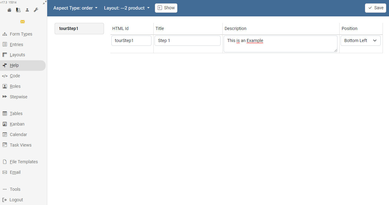
For each form, a help tour can be defined to explain how to use the form. To do this, you need to set an HTML ID for the rows and columns where you want the help text to appear. All existing HTML-IDs will be displayed in the help view and can be provided with appropriate explanatory texts.
Code
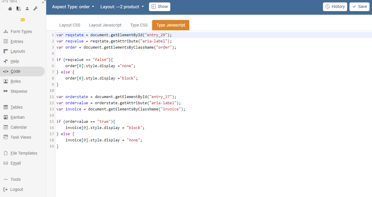
In the "Code" section, individual Javascript code as well as CSS stylesheets can be stored for the respective type or individual form. This can be useful, for example, if form fields are to be checked by validators.
Roles
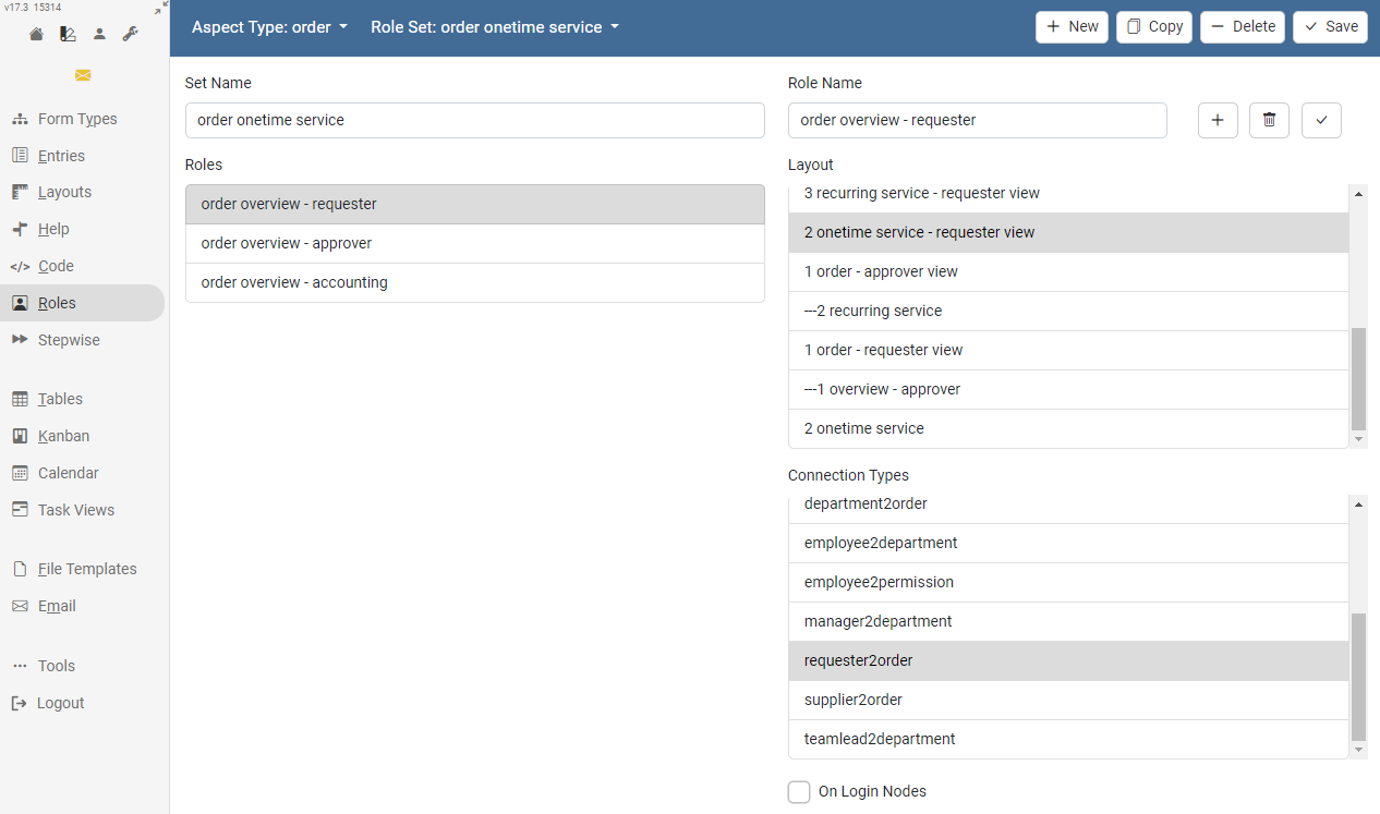
Forms can be divided into different views, either to display views for different authorization classes or to divide complex forms into different subareas. The definition of these "roles" is done in the section with the same name.
Different layouts must exist for a role. In addition, the connection types that are to be used to differentiate the views should have been created in advance.
Stepwise
If a form is divided into several views, the user can be guided more strongly during the input by defining a sequence. The user can then declare the active view closed and switch to the next view.
If a role set is also defined for these views, the user will see all views and can switch between them using the tabs as usual.
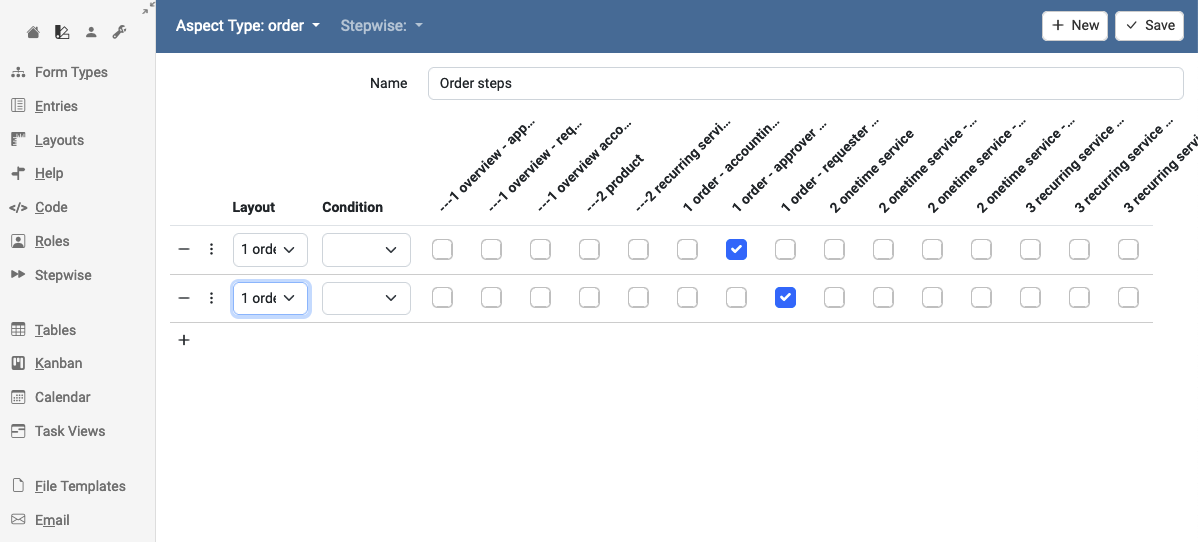
Table Views
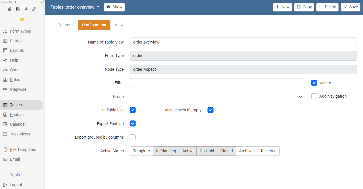
The "Tables" area is available for creating or editing a table view. Here, based on the fields available for the type, a corresponding table overview can be created.
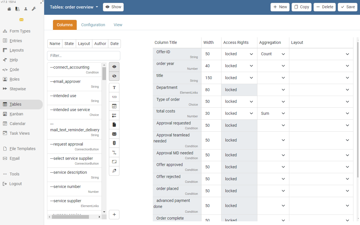
The creation of a new column is done by selecting the respective field in the field list. The individual columns can be moved in position via drag & drop.
On the tab "Configuration" the behaviour, e.g. sorting, of the respective table can be configured.
Kanban Boards
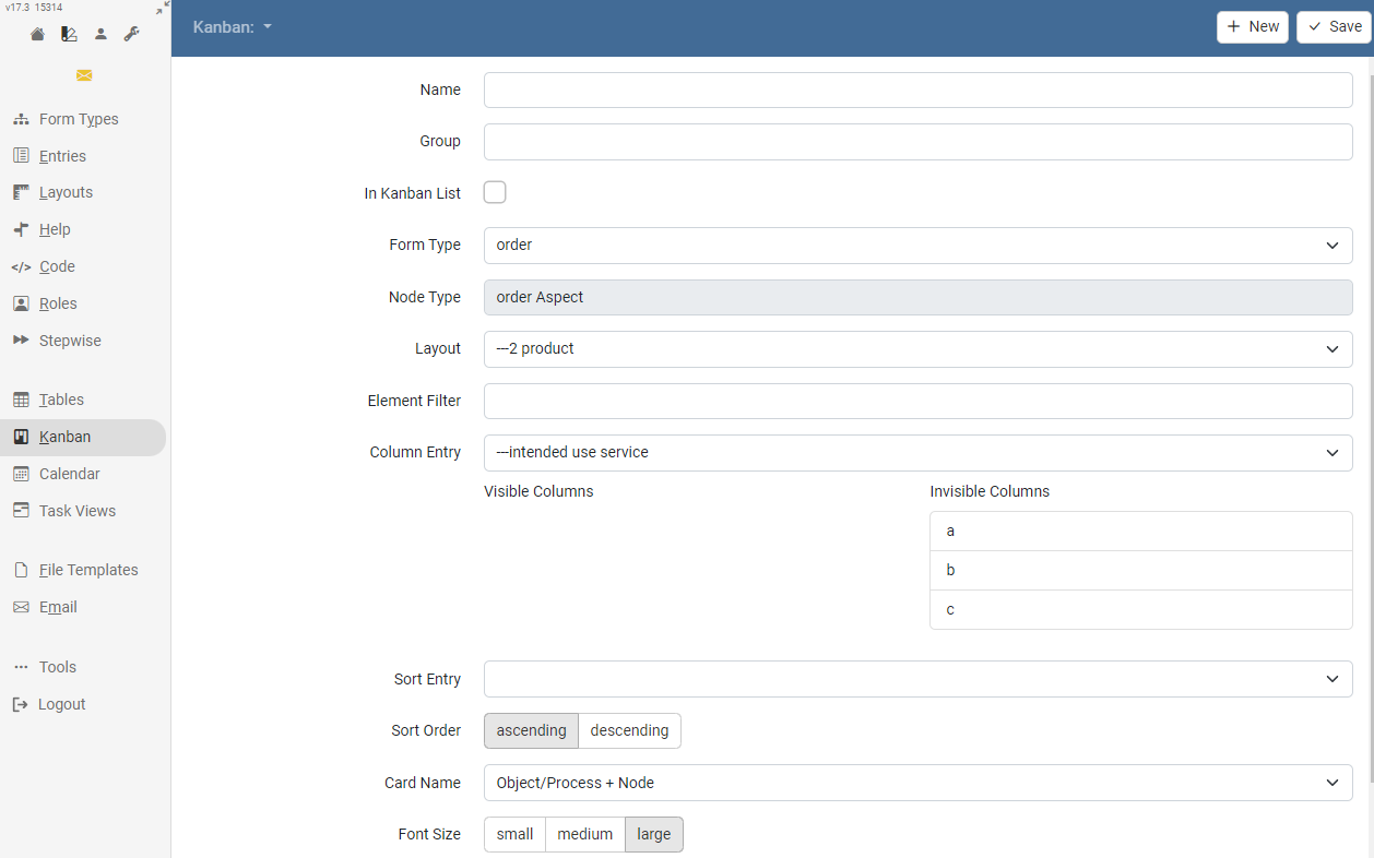
If a Kanban board is required, it can be configured in this area. A corresponding layout for the kanban card should have been created in advance.
Calendars
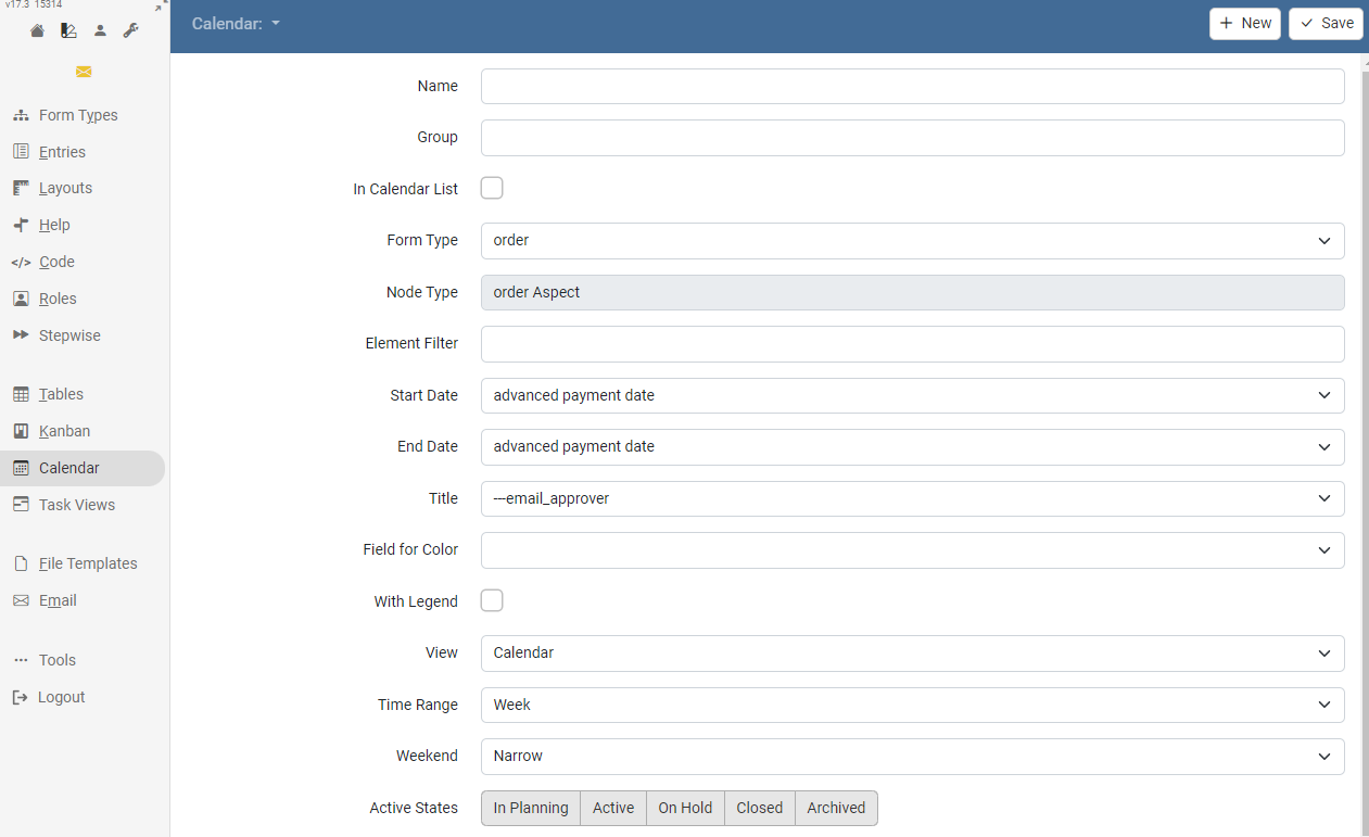
If a type contains two date fields for start and end and a string field with an identifier, a calendar can be defined that displays all data sheets as appointments. Optionally, a choice field can be specified that categorizes the appointments. These are then displayed in different colors.
Task Views
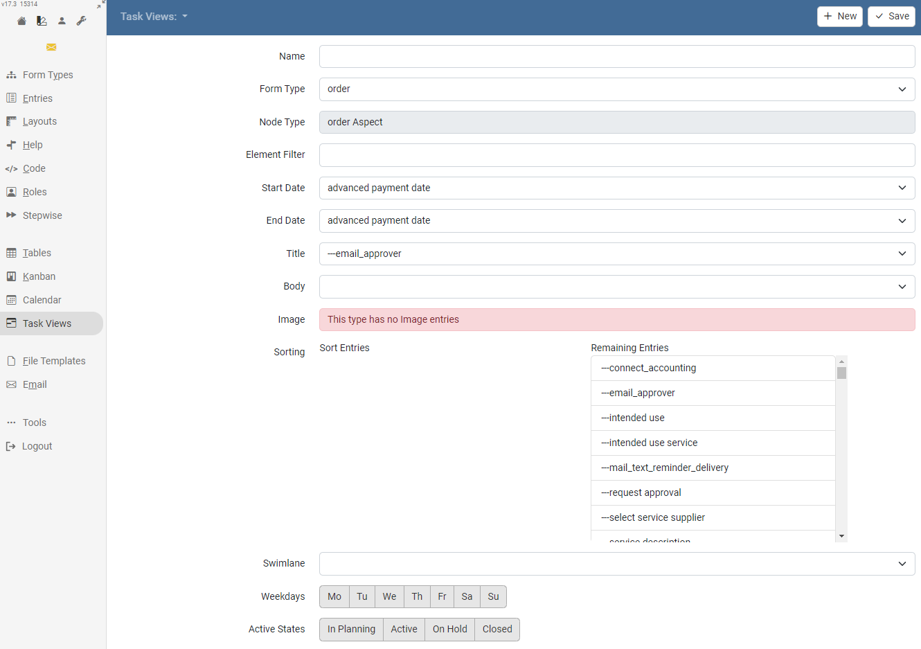
If a type contains two date fields for start and end and a string field with an identifier, a task overview can be defined that displays all data sheets as a task in a weekly view. Optionally, a string field with a description and an image field can be specified to help visualize the tasks.
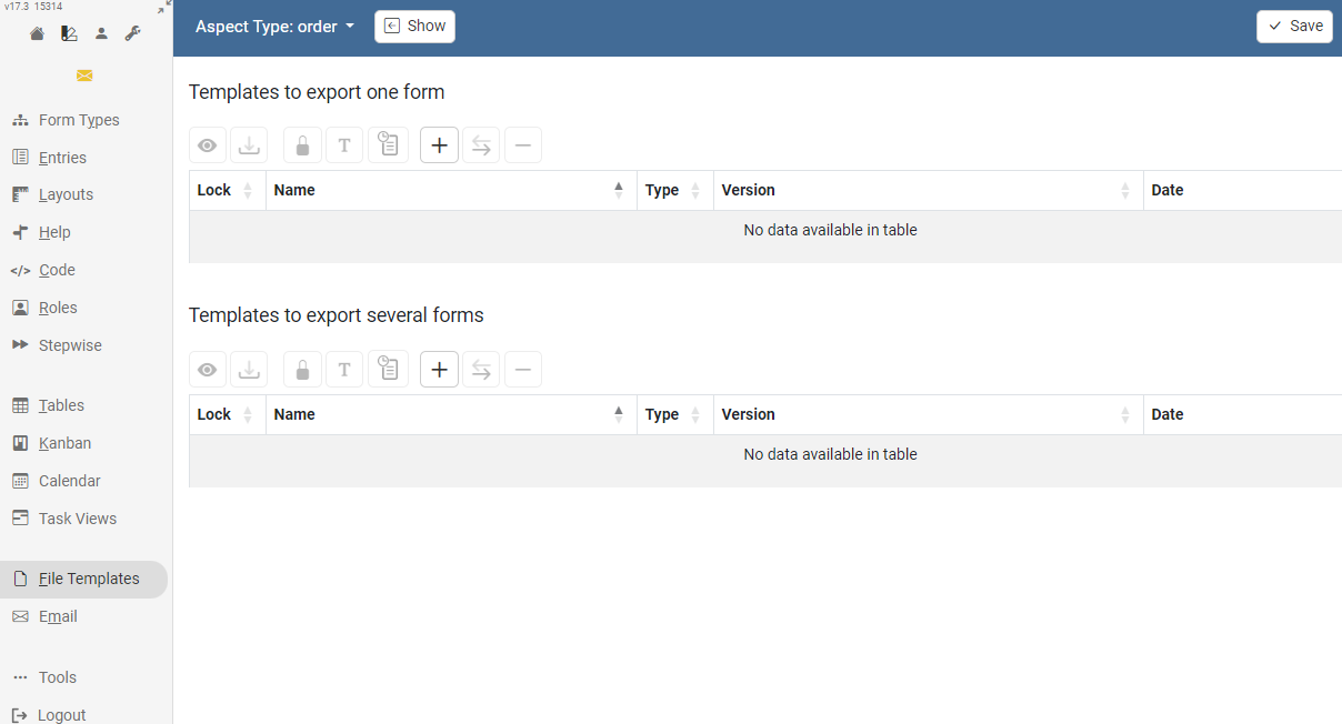
File Templates
In this section, you can upload the file templates that will be used for a file export.
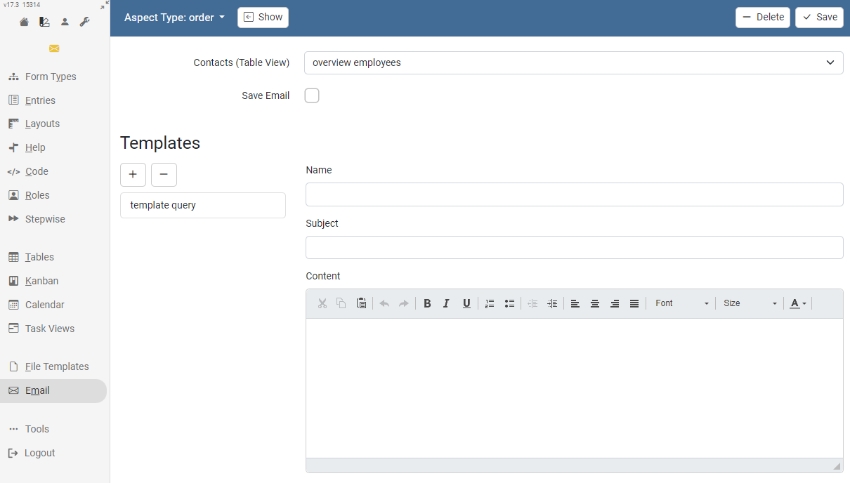
Mail templates can be used either for the regular mail function or also in mail buttons. Placeholders for field values of the form can be inserted in the form ${fieldname}. Use the placeholder ##DEEPLINK## to add a link to the current datasheet.
Keyboard shortcuts
| Function | Shortcut |
|---|---|
| Save (Save) | STRG + ALT + S |
| Delete (Delete) | STRG + ALT + D |
| New (New) | STRG + ALT + N |