Low Code
The HTML frontend of REWOO Scope is a platform that offers numerous options for presenting data on the desktop, tablet or smartphone in a clear and well-structured manner.
The web client is already fully operational even without further modeling effort. Nevertheless, additional adjustments can be made to further tailor the user experience on the various devices to the respective expectations.
The possibilities of different languages and frameworks are available here. These include, among others:
- HTML
- CSS
- JavaScript
- jQuery
- Bootstrap
Most configuration options can be found in the Designer on the Layouts and Code pages.
Optimize layouts for different screen sizes
.Since layouts such as those created for the desktop can easily look cluttered and confusing on smaller screens, there is the option to have the layout, size and position of fields displayed differently on mobile devices than on laptops and desktops. This makes it possible to offer an optimized datasheet layout for every resolution.
To design for the different screens, you can either switch between the four screen classes at the top right and then use the plus and minus buttons to enlarge or reduce the individual columns and rows. Or you can open the layout settings for a column or row with the cogwheel. There you can directly change the size for all screen classes and specify additional CSS classes.
As a basis for the layout REWOO Scope uses the framework Bootstrap 5. All rules, options and CSS classes of the Bootstrap grid system can be used here (more information about this on the official Bootstrap website).
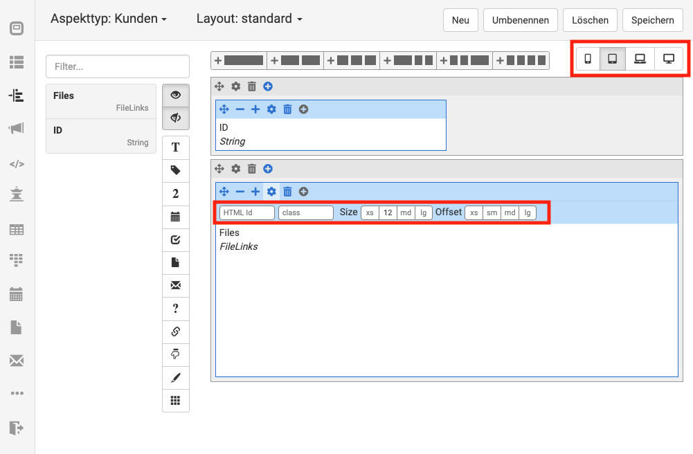
HTML-ID - Rows and columns can be assigned an ID to make them easier to style with CSS or access via JavaScript. Also, an HTML id is required to store an explanation for this part of the form in the Help Tour.
CSS-Classes - Additional CSS classes can be assigned to individual rows and columns.
Size - This sets the column width for each device class, as is done in Bootstrap. The individual input fields represent each device class, from left to right: xs, sm, md, lg. All the rules of the Bootstrap grid system apply here.
Offset - This sets the left spacing of a column for each device class, as is done in Bootstrap. The individual input fields represent each device class, from left to right: xs, sm, md, lg. All the rules of the Bootstrap grid system apply here.
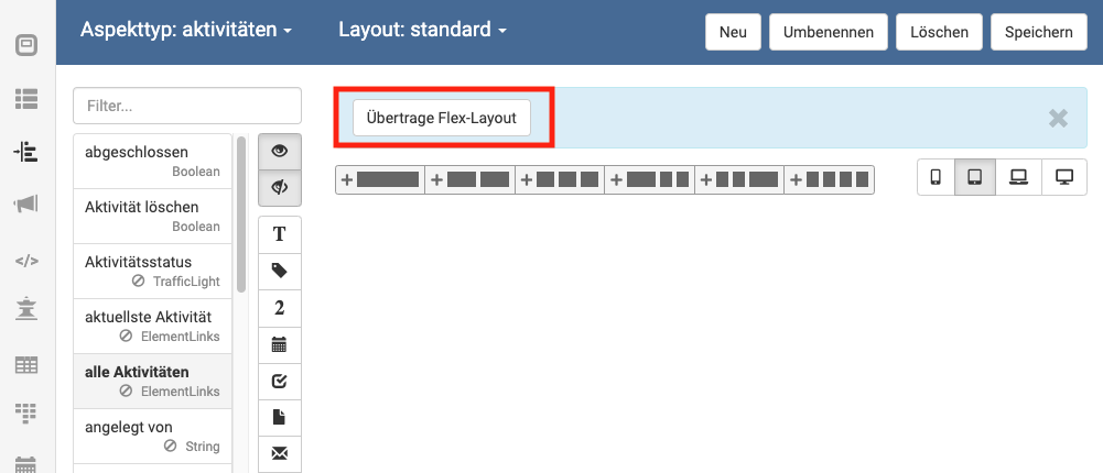
Create layout automatically
If an old Flex layout exists, an HTML layout can be automatically created from it. The generated layout can then be further modified and customized.
Design change (CSS)
The HTML frontend of REWOO Scope comes with a serviceable, simple and typical Scope color scheme. However, this can be adapted to your own needs. Changing the color scheme and also some adjustments of the basic design are possible with it. For example, your own branding or logo can be displayed or a corporate design can be applied to Scope.
The changes have to be entered as CSS in Scope. There are different options available for this:
Global CSS integration
Changes that are to affect the entire client can be stored by an administrator as CSS directly in the configuration of REWOO Scope.
For more detailed instructions, see the Configuration chapter in the Technical Manual.
Layout-specific CSS integration
If changes are to appear only on selected form layouts or different data sheets are to be designed differently, layout-specific CSS can be stored. To do this, select the page for the code in the Designer and then switch to the desired form type and layout. There you can now save all changes in the CSS field. The CSS stored here is only used on forms of the respective type with the specified layout. To make the CSS available to all layouts of this type, the "Type CSS" tab must be edited.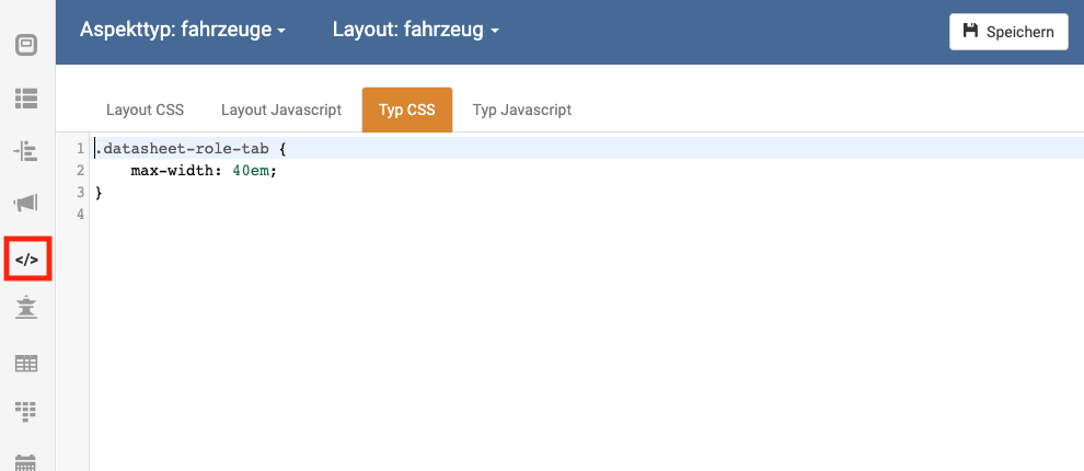
CSS examples
Width of tabs above the form
If the form has multiple pages, tabs are displayed above the form for scrolling. The following code can be used to change the maximum width of the tabs.datasheet-role-tab {
max-width: 40em;
}
.datasheet-role-tab:hover {
    text-overflow: clip;
    white-space: normal;
    word-break: break-all;
}
Customizing the menu
Hide menu items
The global CSS can be used to control not only the general appearance of the menu, but also the number of menu options offered. For this purpose, each menu item has been assigned a matching ID. These are in detail:
menu-item-start: Reference to the user's personal start pagemenu-item-bookmarks: List of bookmarksmenu-item-tables: Reference to the list of table viewsmenu-item-kanbans: Reference to the list of kanban boardsmenu-item-calendars: Reference to the calendarmenu-item-inbox: Reference to the inboxmenu-item-navigator: Reference to the navigatormenu-item-search: Reference to the full-text search pagemenu-item-back: Back to previous pagemenu-item-tools: Reference to the page with more toolsmenu-item-logout: User logout
#menu-item-inbox {
    display: none;
}
It is important that the entry is only hidden. If the user knows the specific link to the desired page, he can of course still call it up.
Display menu always collapsed
By default, the menu is displayed folded out on the left edge. Only when the user's screen falls below a certain size (e. g. on a smartphone) is the menu collapsed and a so-called "sandwich button" is displayed in the upper left corner. After clicking on this button, the menu is displayed again. Via the configuration parameter mobile.menu.style the menu can be displayed folded.
Customize fields
In addition to the possibility to customize the appearance of the fields with CSS, there is also the possibility to control the behavior or appearance via configuration parameters.Position of plus and minus buttons for tables
By default, a plus and a minus button is displayed on the right side of each line for table fields. If these controls are to appear on the left, this can be set using the datasheet.table.buttonPosition configuration parameter. If this is set to the value "left", the corresponding buttons will be displayed on the left side of each table row. However, the buttons are displayed in reverse order, i.e. the plus button comes first and then the minus button.Show quick save dialog
By default, after user changes to a datasheet (or when copying an element), a small popup is shown once the user has scrolled down a bit. This dialog can be used to either save or discard the changes directly (or create the element directly in the copy case). The position and size of the popup can be changed via the configuration parameters datasheet.quickOperationsPopup.position and datasheet.quickOperationsPopup.size. The colors of the dialog are adjusted via CSS and the "background" attribute for the following classes:- popup-header (title line of the popup)
- popup-content (content of the popup)
Include additional JavaScript
Global JavaScript
JavaScript code to be included throughout the Mobile client can be stored by an administrator directly in the configuration of REWOO Scope.
For more detailed instructions, see the Configuration chapter in the Technical Manual.
Locale JavaScript
In addition, JavaScript code can be defined for each type. This can be used to add further mechanisms and functionalities if desired. To do this, select the page for the code in the Designer and then switch to the desired form type and layout. There, additional code can now be stored for the entire type or the individual layout in the JavaScript field.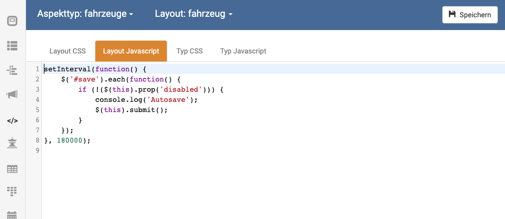
Examples
Autosave of datasheets
If you include the following code snippet as type-wide JavaScript, every 180,000ms (i.e. every 3 minutes) the currently opened datasheet of this type will be saved automatically, provided that changes have been made by the user. These are indirectly recognized by the fact that the save button (with the id 'save') is active. Important: since the user's manual saving is "emulated" by a script, the same effects occur as with manual saving, i.e. on the one hand a new version of the form is created with each saving process, on the other hand the form is reloaded after saving (which is why the screen is scrolled upwards).setInterval(function() {
$('#save').each(function() {
if (!($(this).prop('disabled'))) {
console.log('Autosave');
$(this).submit();
}
});
}, 180000);
hide empty datasheet fields
With this snippet you can hide fields that have no content for the user. This is useful if you want to build dedicated anchors for certain permission groups, which then contain only relevant information. The defined classes (here: "private-infos" and "private-infos-content") must then be assigned to the respective Bootstrap containers in the HTML Designer. The first class defines the container that should be removed. The second class must be entered at the field where the content is to be checked.$('.privat-infos').each(function () {
if ($(this).find('.privat-infos-inhalt .content input').attr('value').trim().length == 0) {
$(this).hide();
}
});
$('.privat-infos').each(function () {
	if ($(this).find('.privat-infos-inhalt .content input').attr('value').trim().length == 0 && $(this).find('.privat-infos-inhalt2 .content input').attr('value').trim().length == 0) {
		$(this).hide();
	}
});
if ($(this).find('.privat-infos-inhalt .content div').text().trim().length == 0) {Show or hide data sheet fields in real time
With the help of the following code example, it is possible to show or hide certain data sheet fields, depending on user input. In the example, a checkbox is used to show fields that are hidden by default. In order for the code to work, a CSS class must be stored for the affected fields that are to be shown or hidden (here "serial appointment"). The field to be used for checking must have an HTML ID (here "serientermincheck").
	var serie = document.getElementById("inverse_entry_171");
	var details = document.getElementsByClassName("serientermin");
	var seriewert = serie.getAttribute("value");
	if (seriewert == 'false'){
		for (var i=0;i<details.length;i+=1) {
			details[i].style.display = "none";
		}
	}
	$('#serientermincheck').change(function(){
		seriewert = serie.getAttribute("value");
		if (seriewert == 'true'){
			for (var i=0;i<details.length;i+=1) {
				details[i].style.display = "block";
			}
		} else {
			for (var i=0;i<details.length;i+=1) {
				details[i].style.display = "none";
			}
	}
})
Disabling buttons after user input
Since pressing a button in the HTML client causes the page to be reloaded, there is a risk that previously made user input will be lost by the click. To prevent this, it is useful in some cases that the buttons are disabled if the user has previously made changes to the data sheet. This can be achieved with the following code.
(function() {
    var disabledBtnCaptions = collectBtnCaptions($('.entry input[type="button"]:disabled, .entry button:disabled'));
    function collectBtnCaptions(elements) {
       var captions = [];
       elements.each(function() {
         captions.push(getBtnCaption(this));
       });
       return captions;
    }
    function getBtnCaption(element) {
       if ($(element).is('input')) {
         return $(element).attr('id');
       }
       return $(element).children().text();
    }
    $(document).on('headerBtnChanged', function (event, changedElementId) {
       var changedBtn = $('#' + changedElementId);
       if (changedBtn.attr('name') === 'save') {
         var allSheetBtns = $('.entry.copybutton input[type="button"], .entry.actionbutton button, .entry.signature button, .entry.connectionbutton button, .entry.tableviewbutton input[type="button"]');
         allSheetBtns.each(function() {
           var caption = getBtnCaption(this);
           var btn = $(this);
           if (disabledBtnCaptions.indexOf(caption) > -1) {
             return;
           }
           if (changedBtn.attr('disabled')) {
              btn.removeAttr('disabled');
         } else {
              btn.attr('disabled', 'disabled');
          }
         });
       }
    });
})();
Validators
Validators enable the checking of values and user inputs according to predefined rules. If a user input is invalid (for example, a value is too small or too long), an error message is displayed and the datasheet cannot be saved until the input is corrected. For easy definition of such validators, REWOO Scope provides its own validator API, which is described below.
Currently supported are String, Date and Number (Email fields have a validator built in by default which checks for valid email addresses. So there is no need to create an additional validator for it). A validator can be defined for normal fields as well as for fields within tables.
Syntax
The following sample code shows the syntax of the Validator API and only needs to be slightly modified for use with other fields. This code must be stored as a script in the Designer for the respective data sheet type (see section "Include additional JavaScript").addValidator("Field name", function(value, context) {
if ( condition ) {
return "error message";
}
return null;
});field name - The name of the field to be validated.
Error message - The message (as a string) that the user will see when an incorrect entry is made.
Condition - This is where the actual validation takes place, usually in the form of a comparison between the current value of a field with a constant value or another field value. Since this is a traditional JavaScript expression, all Boolean expressions are allowed. In addition, conditions can also be nested and combined, or multiple different checks can be performed within one addValidator function. The following is a selection of the most important comparison operators supported by JavaScript:
| Operator | Function |
| == | is equal |
| != | is not equal |
| < | is less than |
| <= | is less than equal |
| > | is greater than |
| >= | is greater than equal |
Use Number and Date fields
Field values are always returned as strings. However, if a Number or a Date field is referenced, this value must first be converted to a number or a date in order to be subsequently compared with other number and date values. The following function can be used for this purpose (units are then ignored):toNumber(value)toDate(value, format, language)Note - The toDate function must be supplied with the date format (e.g. "dd.mm.yyyy" for the German date format) and a language (e.g. "de" for German or "en" for English) in addition to the pure date value in order to successfully convert the string value into a date value.
Comparison with another field
Within anaddValidator function it is also possible to read another field in order to compare it afterwards with the current field. For this purpose the getValue function can be used, which has the following signature:
getValue(entryTitle[, context] [, notifyOnChanges])context must be passed whenever the referenced field name represents a field within a table (so that it is obvious what the current row is). However, we generally advise passing the context. The notifyOnChanges parameter is set to true by default. In this case, even changes to the referenced field will cause the validator function to re-evaluate. If this is not desired, the parameter must be manually set to false.
If the value of a normal field with the title field name is to be read, this can be realized with the following call: getValue("field name")getValue("field2", context)Examples
The following examples are intended to illustrate the many uses of theaddValidator function. Important code parts are highlighted in color.
order value must not be less than 0
addValidator("Auftragswert", function(value, context) {
    if ( toNumber(value) < 0 ) {
        return "The order value must not be less than 0!";
    }
    return null;
});
Leave request must not include none and not more than 5 days
addValidator("Vacation days to be requested", function(value, context) {
    if ( toNumber(value) <= 0 ) {
        return "Please enter a valid number of days!";
    }
    if ( toNumber(value) > 5 ) {
        return "No more than 5 vacation days can be taken at a time.";
    }
    return null;
});
Delivery address and billing address must be identical
addValidator("Address for deliveries", function(value, context) {
    var rechnungsadresse = getValue("Rechnungsadresse", context);
    if ( value != rechnungsadresse ) {
        return "Delivery address must be: " + rechnungsadresse;
    }
    return null;
});
Number of hours spent on a work step must not be greater than the total hours (both values are included in a table)
addValidator("Hours Work step", function(value, context) {
    if ( toNumber(value) < toNumber(getValue("Gesamtstunden", context)) ) {
        return "You cannot spend more hours on the step than you have worked in total!";
    }
    return null;
});
Veto functions
Veto functions are quite similar to validators, but they are not attached to a single input field or table, but can prevent the saving or copying of a data sheet completely detached from data sheet contents. Veto functions are basically only considered after all conventional validators have been executed: if these already report an error, the result of the veto function is ignored and also not displayed.
Syntax
The following sample code shows the syntax when adding a new Veto function as JavaScript via the datasheet designer (see section "Include additional JavaScript").
addVeto(target element, function() {
    if ( condition ) {
        return "error message";
    }
    return null;
}, Ereignis, Kontext-Selektor);
Target element - A reference to the DOM element which should contain the error message as a container in case of a veto. Important: the target element must necessarily have the class "form-group", possibly this class must be added to the element dynamically via JavaScript beforehand.
Error message - The message (as a string) that the user will see in case of a veto.
Condition - An arbitrary condition to decide whether to veto or not.
Event (Optional) - Since a veto function is only re-evaluated when conventional validators would also be re-evaluated (e.g. when entering a value in a form field), it may become necessary to call the veto function on other occasions as well (for example, when clicking a control on the page). For this reason, this parameter can be used to specify an event at which a complete re-evaluation of the validators (and thus also the veto functions) should be triggered. The event must be specified as a string, which can be interpreted by jQuery as an "event" (see jQuery documentation).
Content selector (Forced if "event" is specified) - Specifies the context within which to listen for the event. The selector must be specified as a string that can be interpreted by jQuery